Redpoint Training Project

Brief overview

For this university project, I treated it like a real client task, creating a five-page website with a CMS, APIs, and peer collaboration, along with a design process document and reflection.

About my role

My role encompassed all aspects of the project, from creating initial low-fidelity and high-fidelity designs to conducting research, coding, and implementing a CMS a long with two API's.

Timeline

The project was assigned a timeline of January 2023 to May 2023, providing five months to complete all phases, including planning, development, and final delivery.

Tools used for the project

Notion's logoFigma's logoIllustrator's logoPhotoshop's logoGithub's logo
Visit redpoint training

01: The objective

A clear brief outlining the purpose of the project

We would like you to create a website prototype using HTML, CSS, and JavaScript that includes at least five pages of content centered around a specific theme. Once the prototype is complete, the website should be converted to PHP, with a CMS integrated to manage the site's content.

Additionally, we would like you to collaborate with a peer to populate the site with content and conduct testing to ensure functionality. The final website must include at least two embedded APIs.

Alongside the development, we require a design process document that details your workflow and decisions, starting from the inception of the project. A student reflection summarizing your experience and learnings from the assignment will also be expected.

02: Research, definition and analyses of Content Management systems and API’s

Exploration and analysis of Content Management Systems and APIs, defining their roles and functionality

CMS stands for Content Management System and are software applications used for creating, managing & publishing digital content, primarily the purpose of these is to streamline the production of creating & publishing content.

There are many types of CMS, ranging from open source, proprietary & Software-as-a-Service. Open-source CMS software means you can download it at no extra cost, plus there are no license, upgrade fees, or contracts some popular examples include WordPress, Joomla & Magento. Proprietary CMS is built & managed by a single company, generally involving buying a license fee as well as paying a monthly or annual charge.

Popular examples include Shopify, Kentico & Sitecore. Software-as-a-Service (SaaS) CMS commonly involves web CMS software, web hosting, & technical support with a single supplier. Hosted in the cloud & based on a subscription model these are virtual solutions commonly for those on a per-user or per-site basis. Some key features to keep in mind when selecting a CMS include:

  • Features
  • User Interface
  • Integration
  • Security
  • Scalability
  • Support
  • Cost
Computer screen displaying WordPress.com homepage with blurred background.

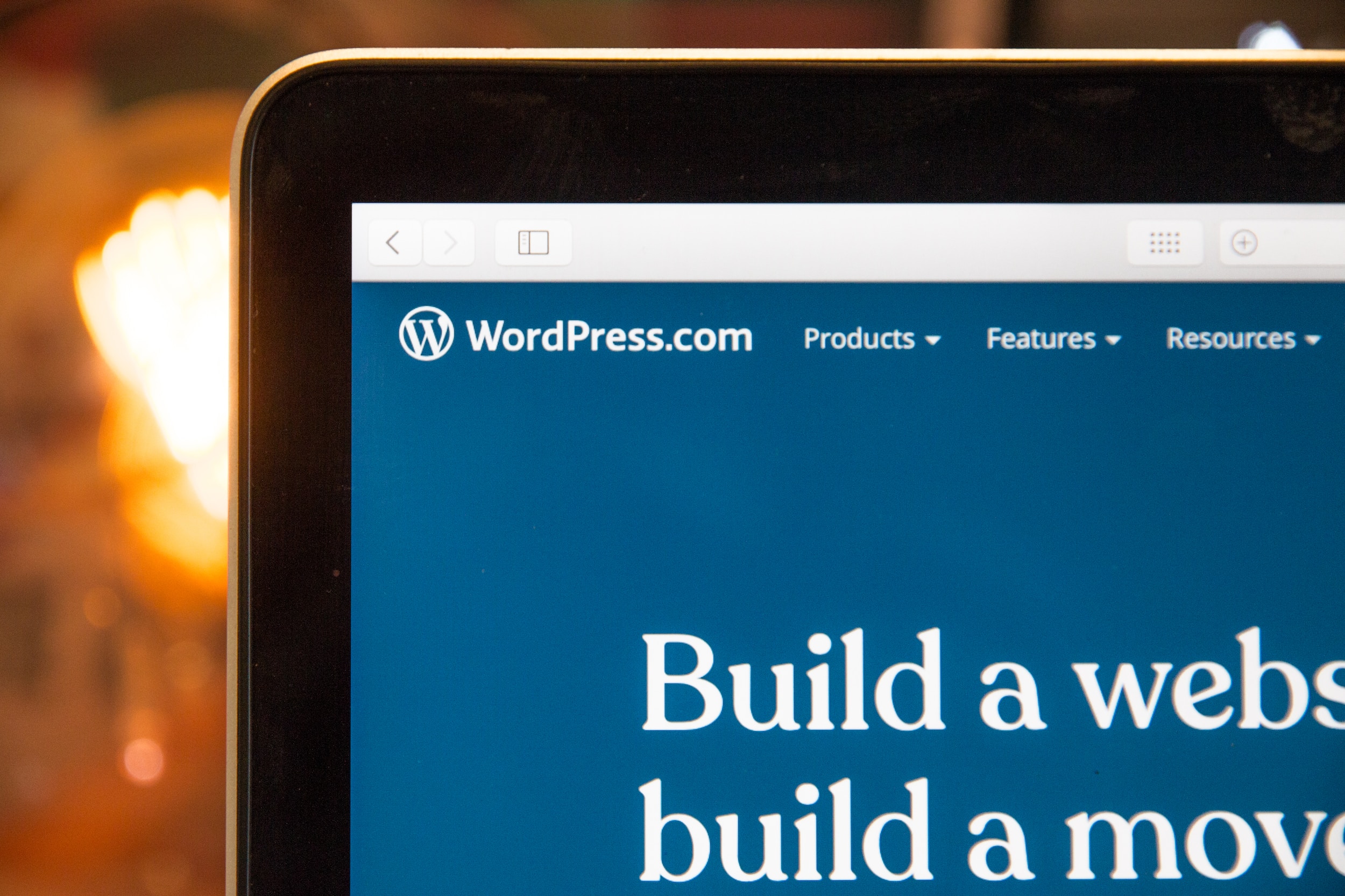
WordPress. Courtesy of Unsplash. Found at https://unsplash.com/photos/zs98a0DtKL4

In conclusion, a CMS is an essential tool for managing digital content, but one must ensure to keep the user in mind when choosing the type of CMS to implement.

An API stands for Application Programming Interface & is used for building & integrating application software from a set of definitions & protocols. One analogy of an API would be a waiter. A waiter takes orders from customers and brings them to the kitchen, then brings the customers their food. Relating back to APIs the waiter acts as a middleman fostering communication between the table & the kitchen. In parallel an API works as a catalyst connecting software platforms together empowering developers to build user-friendly code. Some common examples of APIs include:

  • Twitter Bots: Utilizing the Twitter API there are thousands of bots one example would be a Twitter bot called @MakeItAQoute which creates a graphic containing the tweet it’s been tagged to and the username of the tweet’s author, forming a quote.
  • Google Maps: Google Maps are often integrated into websites as an API to show the location of a business.
  • PayPal: PayPal is a common way people make transfers by allowing users to connect their personal financial information to their PayPal account allowing for easier, more secure transactions.
  • Weather: A quick weather Google search will net the user with a pop-up weather snippet, a common Google feature that is often used.
A laptop on a desk displaying code in an integrated development environment (IDE).

Vscode-Terminal-Laptop-API. Courtesy of Unsplash. Found at https://unsplash.com/photos/ehyV_XOZ4iA

03: Overview of the website theme/ topic and the target audience

A brief description of the website’s theme, topic, and intended audience

My website theme is based on fitness, more specifically a digital service allowing for personalised coaching for rock climbers. There are many websites available that offer this service such as TrainingBeta, Lattice Training, & Climb Strong. However, looking through these websites I feel there is a lot of improvement to be made on the UX/ UI side, especially from an aesthetically pleasing point of view which correlates to the perceived functionality of a website, this is called the “Aesthetic-Usability Effect.”

A person rock climbing on a cave-like rock face at sunset, with bouldering pads on the ground and a scenic mountainous landscape in the background.

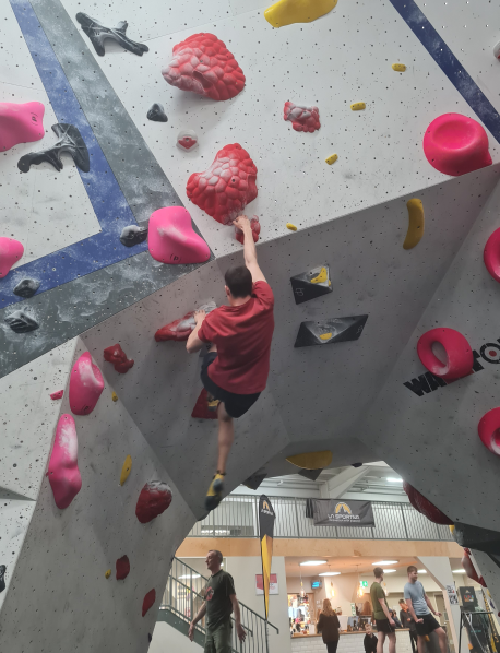
Man-Outdoor-Bouldering. Courtesy of Unsplash. Found at https://unsplash.com/photos/A_mWBNgFi4I

The intended target audience are climbers whether they are novices who have only recently started to climb, or those who are more experienced wanting to break a plateau.

04: Plan/schedule for Project

A visual timeline to organize tasks and deadlines for the project

This schedule helped me stay organized and focused throughout the project. Breaking the work into clear milestones and deadlines made it easier to manage my time and stay on top of tasks like wireframing, prototyping, and testing. It also gave me flexibility to adjust as needed and kept the project moving in the right direction.

A vertical timeline with dates and tasks ranging from "Start Project" to "Finish Project" displayed in white and blue on a dark background.

05: Mood-boards/ creative inspiration

Curated visuals and ideas to spark creativity and guide the design process

I put together a mood board for my Redpoint Training project to spark ideas and set the tone for the design. It was a great way to experiment with typography, color schemes, and visuals that matched the energy of climbing. The mood board kept me inspired and helped ensure the final design felt cohesive and on-brand.

Montage of indoor and outdoor rock climbing images with colorful holds and adventurous climbers.

Being a climber myself I took a lot of inspiration from my own climbing gyms that i go to, for the typography, colour schemes & overall aesthetic. Thus I decided to include an image gallery as part of my primary research for reference.  

For the website itself I wanted to make the user picture themselves at a climbing gym. As I mostly boulder (no ropes-matts instead) myself i leant more heavily towards this side of climbing more than sport (using ropes). Thus I wanted to make the website feel spacious & “big” as if sections of the page were split into boulders. However I still wanted the website to be for everyone no matter what type of climber a user was.

06: Website sitemap

This section showcase a visual representation of the website's structure, showcasing page hierarchy and navigation flow

Original Sitemap

A flowchart with "Homepage" linked to "About Us," "Bouldering Training Plan," and "Checkout" blocks.

The sitemap changed however as firstly i did not have enough pages (4) and needed 5 in total. Secondly later down the line when i was trying to implement the Telegram API I couldn’t get it to work so instead opted to use Google Maps as it is very easy to implement.

Revised Sitemap

Website sitemap showing links from Homepage to About Us, Bouldering Training Plan, and Shop.

07: Early sketches and wireframes

Here I outline Initial design concepts and wireframes outlining the project's foundational structure and layout ideas

Page 1

Homepage
(Wireframe)

Wireframe diagram of a mobile website layout for Redpoint Training, detailing navigation, content boxes, and footer elements.

Page 2

About Us Page
(Wireframe)

Wireframe layout of a website page including sections for about us, boulder training info, and team profiles with images and text placeholders.

Page 3

Bouldering Training Plan Page
(Wireframe)

Wireframe for a bouldering training plan webpage with sections for description, purchase, and reviews.

Page 4

Shop Page
(Wireframe)

Wireframe of a webpage layout with annotations for a product list and parallax header.

Page 5

Rope Page
(Wireframe)

Wireframe for a product page layout with sections for title, images, specifications, and a purchase button.

08: Colour & typography decisions

This section is about my rationale behind the chosen color palette and typography to enhance brand identity and readability

I decided to use a predominantly blue colour with a touch of green, creating a cool, refreshing, deep, vibrant, and tranquil tone to use in contrast with this bold, vibrant, and eye-catching red as well as a neutral base of black plus a comforting, soft and warm beige for the typography.

A graphic with four color samples named Night, Engineering Orange, Colonial White, Teal, with hex codes below each.Webpage displaying the Noto Looped Thai font with examples in various sizes and weights.

The font I ended up choosing was Noto Looped Thai because it’s open source plus due to its accessibility and inclusivity, people who rely on assistive tech such as screen readers will benefit from the improved legibility. Lastly, being part of the Noto font family that provide a set of typefaces for scripts means that I will be promoting consistency.

I also made a logo for my website by using illustrator & photoshop:

An online store page displaying a variety of colorful climbing-themed stickers.Pinterest board titled "Climbing Logo Inspo" with various climbing-themed logo designs.

I traced over a picture of a carabiner i took using the pen tool in illustrator:

A screenshot of a graphic design software interface with multiple logo drafts visible.A graphic design software interface displaying various logo mockups for a brand called 'Redpoint Training'.

Multiple variations of the initial design:

Multiple variations using different backgrounds:

Final Logo

Logo of "REDPOINT TRAINING" with a stylized carabiner in red and black colors.

09: Accessibility principles

These are some key guidelines to ensure the website is usable and inclusive for all users

To make my website accessible for as many people as possible i will follow these guidelines:

Open laptop on a wooden table displaying a webpage that reads, "I design and develop experiences that make people's lives simple.

Laptop - quoting - “I design and develop experiences that make people’s lives simple.” Courtesy of Unsplash. Found at https://unsplash.com/photos/bs2Ba7t69mM

  • Ensure that all content is perceivable to users by using appropriate colour contrasts
  • Use alt text on images for those with visual impairments
  • Use a consistent organized & predictable layout – Jakob’s law – users prefer your site to work the same as other sites
  • Design for all platforms and devices by using elements such as media queries for screen sizes
  • Follow web standards
  • Make sure CTA buttons are clear i.e., buttons highlight when hovered over
  • Make website keyboard accessible

10: Planned content/ copy examples and annotations

A detailed showcase of the content frame, highlighting planned structure and key elements for the website’s organization

Content Frame:

A vertical flowchart with multiple branching paths, color-coded to differentiate sections.

11: Prototype screenshots and annotations

Visuals of the prototype with detailed annotations explaining design decisions.

An annotated wireframe layout for Redpoint Training's website, highlighting structure, content sections, and design elements.A website layout mockup for REDPOINT Training with notes on design elements, team structure, and training plans.Screenshot of REDPOINT Training website page detailing a bouldering training plan with pricing, testimonials, and additional information.Mobile view of a climbing gear shop website with product cards, navigational menu, and footer links.Screenshot of a web page featuring a climbing rope product with images and detailed specifications.Design mock-up showing the mobile menu for 'RED POINT TRAINING' with notes for developers.Two mockup screens of a prototype checkout process with delivery and payment method forms.

12: Completed website screenshots

Final visuals showcasing the fully designed and functional website

Home Page

Climber on an indoor wall featured on a climbing training website's homepage.

About Us Page

A screenshot of the "Redpoint Training" climbing gym website page, featuring sections about their services, team, and contact details.

Bouldering Page

A climber bouldering outdoors on a rock face, with text about strength and training plans.

Shop Page

Climbing gear shop webpage with products, a climber, and a contact map.

Rope Page

"Climbing rope advertised on a website with product details, price, and climbing action image."

13: User Testing documentation & testing plans

Records of user testing processes, including detailed plans and results analysis

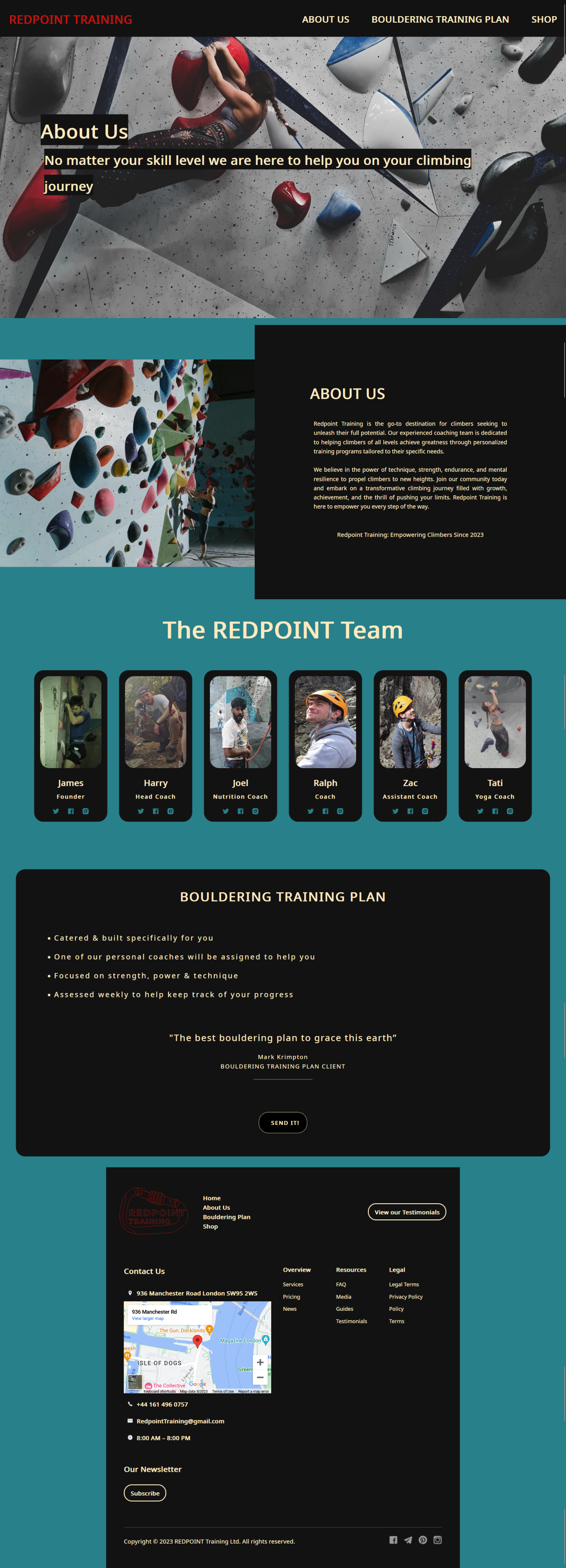
As you can see from the final screenshots of my website & the high-fidelity prototype pages, I tweaked a few things with the website, here i will go through the steps/ overview of how i coded my website.

Initially i coded the navbar, i tried to use an SVG of my logo in the header however i couldn’t get this work thus opted to use text instead.

Using JavaScript i coded an animation for the hamburger drop down, i also made the nav bar fixed to solve two issues i was having:

  • Firstly a gap would appear above the nav-bar
  • Secondly having the nav-bar position fixed means that wherever the user is on the page they have instant access to other pages on the site

This is also why i changed the final websites nav-bar from the high-fidelity prototype version of a separate page for the navigation menu as it creates more unnecessary steps for the user.

A split-screen of code editor and climbing gym website with text "We help build climbers to reach their full potential".

Next i coded the parallax for the homepage.

Screenshot of a web development environment with code on the left and a web page design preview on the right.

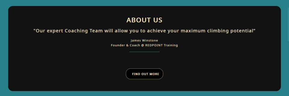
Then i coded the about us box where i had to design the first button where i added a hover effect to it.

A split-screen with code editor on the left and a web page with a bouldering training plan on the right.

Then i added in the bouldering training plan section with a CTA button.

Screenshot of a code editor with HTML code on the left and a web browser displaying a webpage for 'REDPOINT TRAINING' with a reviews section on the right.

I initially coded a manual carousel for reviews, but text overlap on smaller screens persisted despite media queries. I redesigned it as a result.

Screenshot of code in Visual Studio Code and a web page section with a testimonial.

Here i made a constant rotating carousel meaning the user won’t have to do anything saving time and effort while also working as intended.

Screenshot of a web development environment with code editor and web browser previewing a contact page.

I then added the footer embedding the Google Maps API into it.

The following screenshots show rectifications I made during my coding process:

Before

A screenshot of a code editor alongside a web page for a climbing training company.

After

A split screen showing code in a text editor on the left and its web page result on the right.

Before

A screenshot of a coding interface next to a web page about rock climbing training.

After

A split screen with code on the left and a web page titled "REDPOINT Team" with member photos on the right.

Before

Two screens showing website code in Visual Studio Code and its preview for a climbing gym.

After

Screenshot of a code editor on the left and a web page design for a bouldering training plan on the right.

Before

Screenshot of a webpage with HTML code on one side and the designed page on the other, showing 'REDPOINT TRAINING'.

After

Screenshot of a web development environment with code on the left and a webpage preview on the right.

Before

Screenshot of a web development environment with code on left and webpage with red rope image on right.

After

Screenshot showing a code editor with HTML code and a preview of a rock climbing gear webpage.

Before

Screen showing code editor and a webpage about climbing ropes, with an image of a rope and a climber.

After

A screenshot of a web development environment with code and a web page preview featuring a climbing rope.

Before

A split-screen showing code in Visual Studio Code and a web page preview about climbing rope specs.

After

Screenshot of a dual screen setup, one with Visual Studio Code, the other with a rope specs webpage.

14: New copy created by someone else for your site

Edits made to the site by someone using the CMS to update content

I decided to use the home page for the alteration to be made by a peer using Perch CMS, here are the before & after screenshots of this:

Before

Climber on a wall grasping large red holds with a motivational slogan.

After

Climber on an indoor wall reaching for holds with a motivational caption.

Altered the navbar by typing in “hello world” as a h2 element however i wouldn't say anything broke but the “Redpoint Training” title did get pushed to the right.

Before

Web section titled "ABOUT US" with a quote on coaching for climbing potential and a "FIND OUT MORE" button.

After

About us section on Redpoint Training website featuring an inspiring climbing image and quote from founder James Winstone on achieving climbing potential.

The top GIF got centred by the containers CSS however due to the button the bottom one did not. Two GIFs of Alex Honnold (one of the bst climbers and free soloists in the world) climbing el Capitan in Yosemite.

Before

Webpage section displaying a bouldering training plan advertisement with features and a testimonial, including a "Send it!" button.

After

A website page about bouldering with text on safety, equipment, and community aspects.

An article was added which was made with the help of Chat GPT to write the text. Im pretty happy with the way the container “contained” the elements.

Before

Testimonial praising Redpoint Training's balance of physical and mental prep for climbers, by Emil Abrahamsson.

After

Indoor climbing wall with various colored holds and a quote by Magnus Midtbø.

Added a photo as well as a passage of text about climbing. Again the way my website handled the content meant nothing “broke” on the site.

Before

Website footer with contact info, map location, and links to various site sections.

After

Alt text: Webpage banner for REDPOINT TRAINING with an upside-down climber and text about climbing.

Here my peer added an image as well as text related to climbing. This slightly broke the footer on my website due to the image overlapping the text.

Before

Screenshot of REDPOINT TRAINING website's footer with contact info, address, and a Google Maps snippet.

After

Screenshot of Redpoint Training webpage, featuring bouldering articles, contact info, and navigation tabs.

My sites footer still held together after a muster of <h1>,<h2>,<h3><p><strong> etc. tags were put into the CMS. At the end of the footer my peer controlling the CMS added an array of various title tags to try to break my site.

15: Summary

A summary of the project

The Redpoint Training project was a university assignment I approached as if working for a real-world client. The goal was to design and develop a multi-page website for a fictional personalized coaching service tailored to rock climbers. I started by planning the project with a detailed schedule and mood board to guide the creative process. Drawing inspiration from climbing gyms I frequent and analyzing competitor sites, I developed a cohesive design aesthetic that aligned with the adventurous and motivational branding of the service.

I built the initial prototype in Visual Studio Code using HTML, CSS, and JavaScript. Once the foundation was complete, I transitioned the site into PHP and integrated Perch CMS to enable dynamic content management. This allowed a peer to collaborate with me by populating and testing the site with content. To enhance the functionality and realism of the project, I incorporated two APIs: the Google Maps API, which displayed the fictional company’s location, and the Square Payment API, enabling users to (hypothetically) purchase bouldering training plans directly through the site. Ensuring accessibility and responsive design remained a priority throughout development.

This project was a valuable learning experience, allowing me to develop my technical skills in creating dynamic websites and managing APIs. By treating this university assignment as a professional client project, I gained experience balancing design, development, and collaboration to deliver a polished and functional final product.

Let's work together!

Thank you! Your submission has been received!
Oops! Something went wrong while submitting the form.