


The RBGE project aimed to create a donation appeal website for the Royal Botanical Gardens of Edinburgh. The goal was to raise funds to restore and rebuild the historic glasshouses, which are essential for preserving biodiversity and protecting rare plant species. The website was designed to inspire visitors, showcase the importance of the appeal, and encourage donations to support this vital conservation effort.
As a Junior UX Designer at Nexer Digital, I had the opportunity to work on a meaningful project for our client, the Royal Botanical Gardens of Edinburgh. My role involved conducting research to understand user needs, helping to create both low-fidelity and high-fidelity wireframes for mobile and desktop views, and collaborating closely with the RBGE team through regular check-ins to ensure their goals and vision were achieved.
The project was assigned a timeline from January 2024 to May 2024, providing a clear framework of five months to ensure the successful completion of the website. This timeline structured the entire process, from initial planning and collaboration with the client to delivering the final product within the agreed schedule.


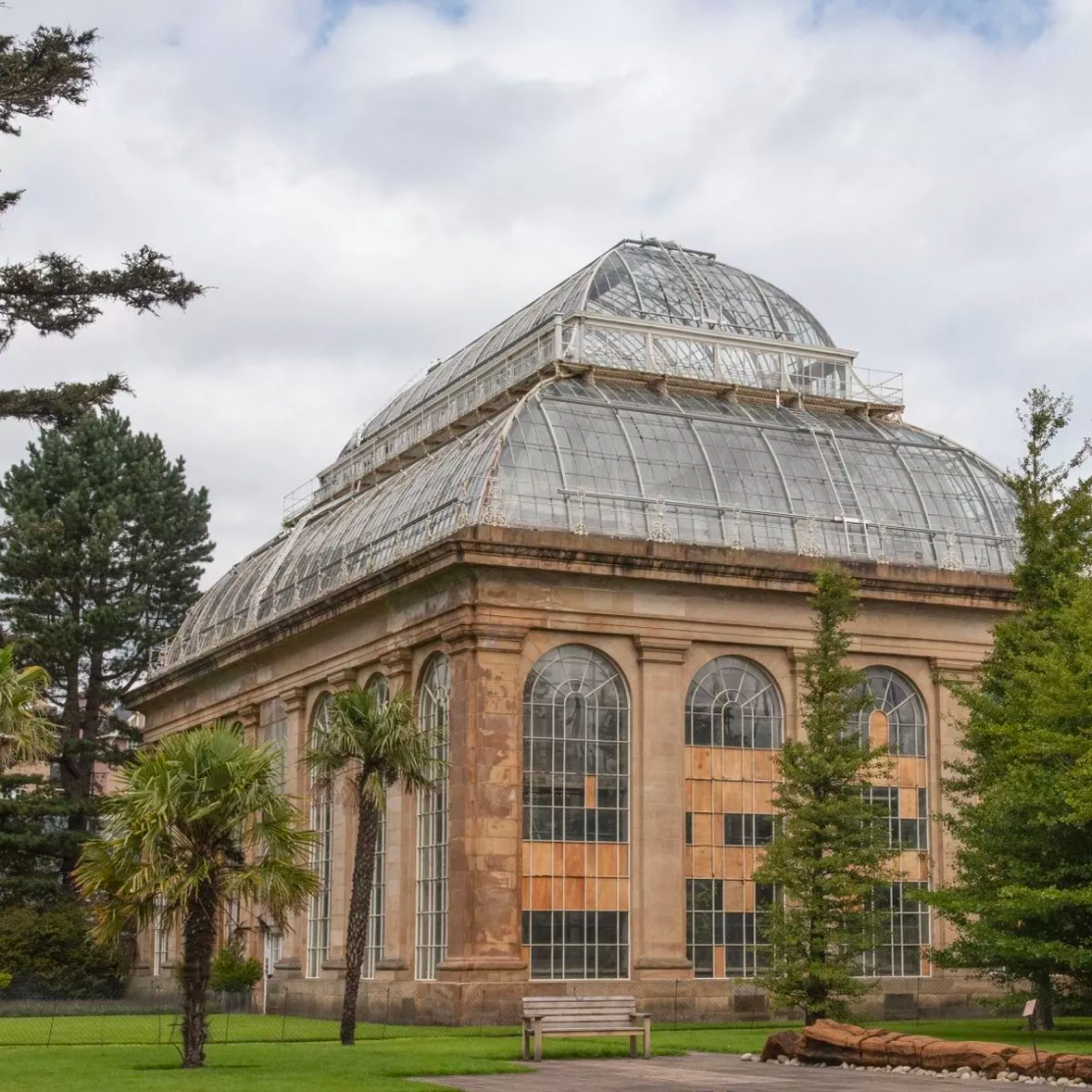
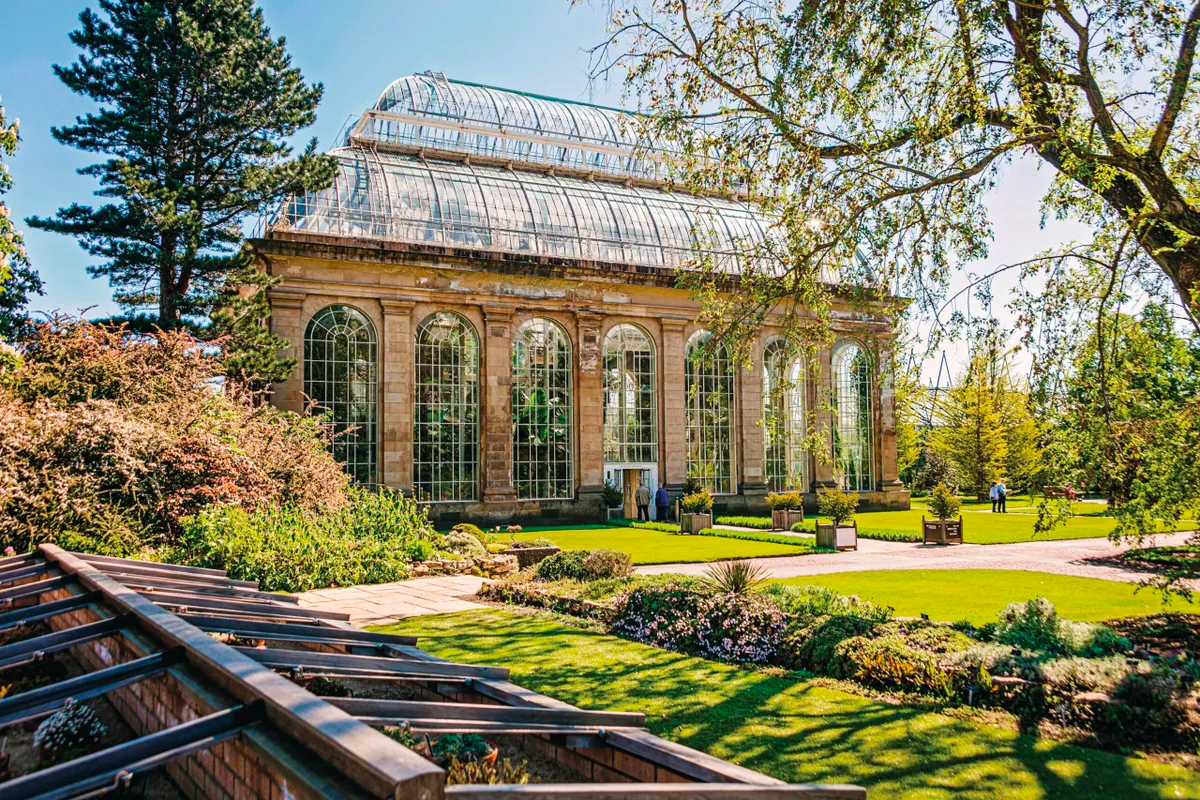
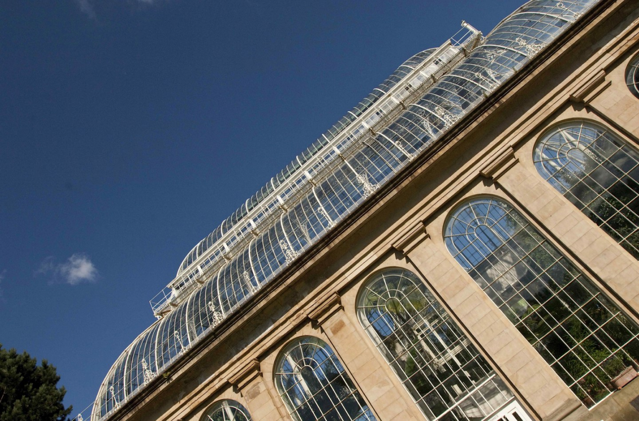
The Royal Botanical Gardens of Edinburgh (RBGE) serve as a global leader in plant conservation, biodiversity preservation, and education. This project was undertaken to create a compelling donation appeal website aimed at raising funds to save and rebuild the Palm Houses, vital structures that safeguard an extraordinary variety of plant species from across the globe.
The Palm Houses and Glasshouses are not only architectural icons but also critical for maintaining fragile ecosystems. Over time, these structures have deteriorated, threatening the plants they protect and their essential role in biodiversity preservation. The website’s goal was to inspire donations and increase public awareness of the importance of this conservation effort.
Project Goals:
Deliverables:
Target Audience:
I researched several prominent donation-based websites, including the National Trust for Scotland, Oxfam, TreeAid, Save the children, Red Cross, Mind & more, to identify successful strategies, understand best practices, and gather valuable insights that would inform the design of the RBGE Palm House Appeal website.
I found that the majority of these sites had a donation widget on the home page to drive more donations & lead to better conversion as it is a seamless integration into the site meaing that there is less steps needed for the user to donate, for example taking the user to another page. Other advatnages of having a donation widget include:
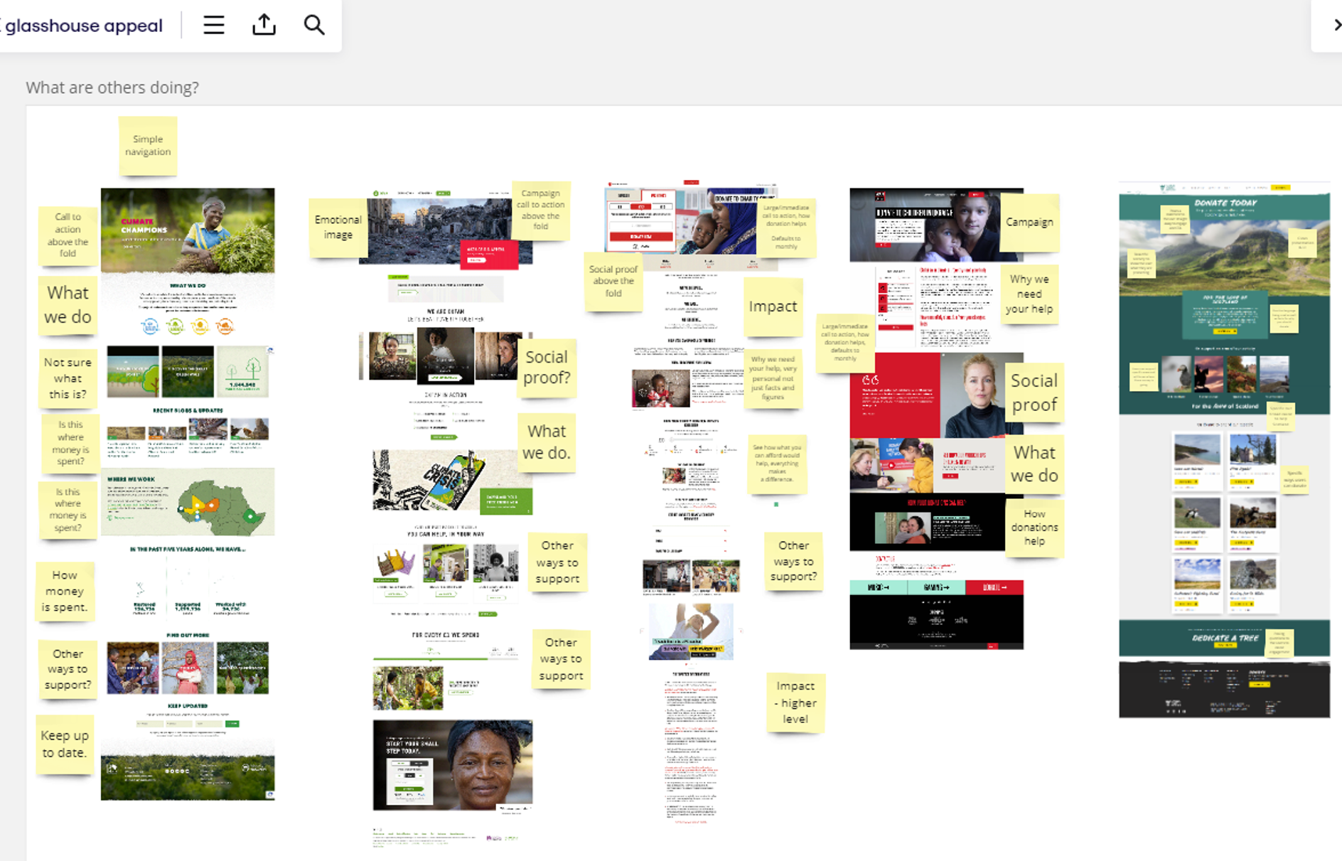
A screenshot of the RBGE glasshouse appeal Miro board detailing what other donation websites are doing
During the research phase, I took screenshots of various donation websites and analysed their layouts by breaking each section down. Using Miro, I organized and labelled the sections with post-it notes to identify common patterns and shared elements across the sites. This is what I found from reseraching these donation based sites:
This research helped in informing how we should go about designing the lo-fi wireframes and subsequently the hi-fi wireframes.
Information Architecture (IA) is the process of organizing, structuring, and labeling content in a clear and logical way to help users easily navigate and find information on a website or application. It focuses on creating intuitive hierarchies, pathways, and systems to improve the overall user experience. IA is crucial for ensuring that content is accessible, efficient to explore, and aligned with user needs and business goals.
During meetings with the RBGE team, we discussed the site's flow and user journey extensively, ensuring it aligned seamlessly with the site's Information Architecture (IA). We wanted to ensure that we organised the content in such as way that effectively communicates the importance of the donation campaign. The IA ensures that users can quickly understand the purpose of the site, navigate through sections like the history of the Palm Houses, the need for restoration, and how to donate.
Key elements of IA on the site that we included:

The Umbraco logo. Courtesy of Umbraco. Can be found at https://umbraco.com/about-us/press/
Umbraco is an open-source content management system (CMS) built on the ASP.NET framework, known for its flexibility and user-friendly interface. It allows developers to efficiently create, manage, and update websites, offering a high level of customization. Umbraco is suitable for a variety of projects, from simple blogs to complex websites such as RBGE. Nexer Digital, is both an official Umbraco partner and the main digital partner for RBGE, which enabled us to leverage our expertise in Umbraco to create a tailored, seamless solution for the Palm House Appeal website.
The Royal Botanic Garden Edinburgh site uses Umbraco as its CMS, which introduced certain constraints on the project’s design due to budget limitations. Reusing existing components that were already built into RBGE's CMS was a cost-effective approach, as it avoided the need for custom development. However, this also meant we had to work within predefined structures, limiting our creative freedom and adding constraints to the design process. Creating new components would require additional time, resources, and testing, as well as integration with the existing system, all of which would significantly increase costs. Striking the right balance between reusing existing components and creating custom solutions that allowed for more creativity was one of the key challenges of the project, but I believe we successfully navigated it.
The initial project brief outlined the need for four pages, with specific details on the content required for each. However, due to budget constraints, this was later reduced to three pages:
Pages included:
Using Miro, I created low-fidelity wireframes based on the brief, which served as a foundation for discussions with the client. These discussions allowed us to align on their expectations while also offering recommendations from a UX perspective. Although I initially found these meetings a bit daunting, with time and effort to contribute, they became more comfortable and productive, fostering a collaborative environment.

A screenshot of the RBGE Miro board detailing low-fidelity designs
Using these lo-fi wireframes as a foundation, we refined and enhanced the designs in Figma to present to the client, including both desktop and mobile views for each of the four pages. However, further down the line we chose to remove the 'A Living Collection' page due to time and budget limitations.

The Campaign page - Lo-fi design presented to the client

A History page - Lo-fi design presented to the client

A Project page - Lo-fi design presented to the client

A Living Collection page - Lo-fi design presented to the client
We drew our color scheme from the RBGE brand guidelines and main website, incorporating a bold pink, various shades of green, white, and gray to shape the site’s aesthetic.

Promotional flyer for the RBGE Palm Houses
We used this colour scheme for the Palm House Appeal not only to maintain consistency with RBGE’s established brand identity but also to reflect themes that align with its mission and the goals of the project.
Here’s the reasoning behind the color choices:

The colours used for the RBGE designs
We chose to pair Helvetica (used for the paragraphs) with Gotham (used for the titles) as the project’s fonts. The reasoning behind this decision is as follows:
Helvetica:
Gotham:

The typography used for the RBGE designs


Before designing the hi-fi wireframes we produced a variety of components in Figma. Components are reusable design elements, like buttons or icons, that help maintain consistency. The main component acts as the master, while instances are editable copies used across designs. Updates to the main component automatically reflect in all instances. Features like variants allow different versions of a component. We used variants to showcase different states of components. For example, for links, we included the default view along with rollover and active states.
We made components not only for desktop but for mobile as well in order to ensure mobile friendliness for a better user experience. This was brokend down into sections for buttons, Icons, banners, text & images, video, case studies, the footer, the nav & the palm mask for the parallax.

A screenshot showcasing key components designed for both desktop and mobile views for the Palm House Appeal.
Using components in Figma for the Palm House Appeal project was incredibly helpful for several reasons. It made the design process more efficient by allowing us to reuse elements across different parts of the site, which kept the overall design consistent. It also made working with developers much easier, as they could see all the variations of a component—like hover states or responsive adjustments—clearly laid out. This meant fewer questions and smoother handoffs. Additionally, having everything organized in Figma allowed us to quickly adapt and make changes when feedback came in, without having to start from scratch every time
It's always good to design from mobile first this is because it prioritizes essential content and functionality for the most common device, ensuring usability, performance, and responsiveness. It simplifies design, aligns with user behavior, and creates a scalable, consistent experience across all devices. With this in mind we decided to follow suit with this to ensure the best user experience possible.

A screenshot showcasing initial hi-fi designs for mobile with notes.
One of the most exciting yet challenging aspects of the project was designing the parallax effect. This effect, where background elements move more slowly than foreground elements as the user scrolls, creates a dynamic sense of depth and motion. I initially conceptualized the arch design, drawing inspiration from the glasshouse arches themselves—an excellent opportunity to showcase my creativity. I experimented with a frosted glass effect to mimic the experience of looking through real glass into the palm houses. However, this idea was later discarded as it overly blurred the designs. Ultimately, we integrated the arch design with the glasshouse as the background, presenting it as a parallax effect. Using Figma, we demonstrated this not only to the client but also to the developers, ensuring they had a clear understanding of how to implement it.

The section in Figma showing designs for the parallax scroll effect.
Another key challenge of the project was designing the timeline section for the 'A History' page, which presented some difficulties. One major hurdle was configuring the auto-layout formatting in Figma. Auto-layout, while powerful for creating dynamic, responsive designs, required careful adjustments to ensure elements were consistently aligned and behaved predictably across various screen sizes. Achieving the right spacing, hierarchy, and responsiveness within the timeline proved tricky, especially when balancing flexibility with visual consistency. Beyond the technical formatting, nailing the styling was equally challenging. The timeline needed to effectively convey historical events in a visually engaging yet intuitive manner, requiring multiple iterations to achieve the right balance of clarity, aesthetics, and functionality. These obstacles ultimately pushed me to refine both my technical approach and creative problem-solving skills, resulting in a timeline design that was both functional and visually compelling.

Timeline section showcasing initial designs in Figma.

Another Timeline section showcasing more designs in Figma.
The final designs for the Palm House Appeal website successfully integrated RBGE's branding with a clean, user-friendly layout that prioritized an intuitive and engaging user experience. By incorporating RBGE's established colour palette, the design evoked themes of nature, heritage, and urgency, ensuring visual consistency across the campaign. The donation journey was streamlined with clear call-to-action buttons, impactful imagery, and concise content, strategically placed to guide users through the site and inspire engagement. The design also prioritized responsiveness, ensuring a visually appealing and functional experience across both desktop and mobile devices. Additionally, by reusing existing CMS components where possible, we adhered to budget constraints while introducing thoughtful design elements that enhanced usability. The final deliverables, refined through hi-fi wireframes and close collaboration with developers, effectively captured the project's goals—encouraging donations and highlighting the importance of preserving the Palm Houses.

The Campaign page final design.

A History page final design.

The Project page final design.
Since the launch of the Palm House Appeal website, the Royal Botanic Garden Edinburgh (RBGE) has made significant progress in raising funds and garnering support for the restoration of the historic Palm Houses. As of June 2024, the campaign has successfully raised £100,000, with private donors matching each contribution, effectively doubling the impact of every donation. This support is essential for the ongoing restoration efforts, which include repairing crumbling sandstone, restoring ironwork, and replacing glass with energy-efficient panes.
The website has been crucial in streamlining the donation process and providing clear, accessible information to visitors, allowing them to easily contribute to the cause. The appeal aims to raise a total of £250,000, and with the website’s continued role in engaging the community, there is growing confidence that the goal will be met. As a UX designer on this project, I’m incredibly proud of how the site has helped facilitate such a meaningful impact, making it easier for people to be part of preserving these iconic structures for future generations.
